MATT NIX BAND
This country rock group needed an updated look, and since I was in the band, created this logo. It is edgy enough to be engaging, yet its classic typography ties to the history of the musical genre.

LAKE PINES PHOTOGRAPHY
Jake Darty is a passionate photographer and does a great job capturing concerts, kids, and beautiful landscapes. This logo was quickly developed based on immediate client feedback.

RUN FOR THE NATIONS
Proceeds from this annual 5K "support teams working overseas that serve those less fortunate by working to meet physical, educational, and spiritual needs in impoverished regions."
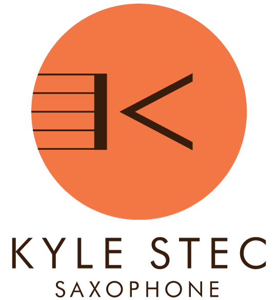
KYLE STEC
Kyle is an extremely talented and accomplished saxophonist and teacher, and his performances are both musically and physically dynamic. The lettermark is made up of musical notation: a staff and an accent or crescendo mark to convey Kyle's energy. The design is clean and precise to connotate his professionalism.
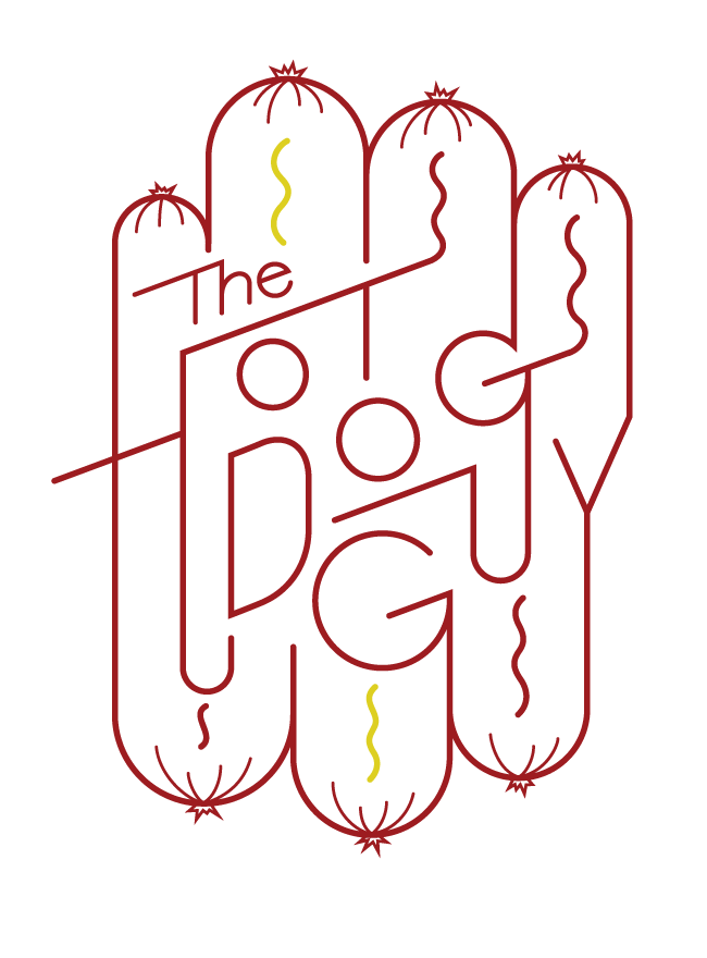
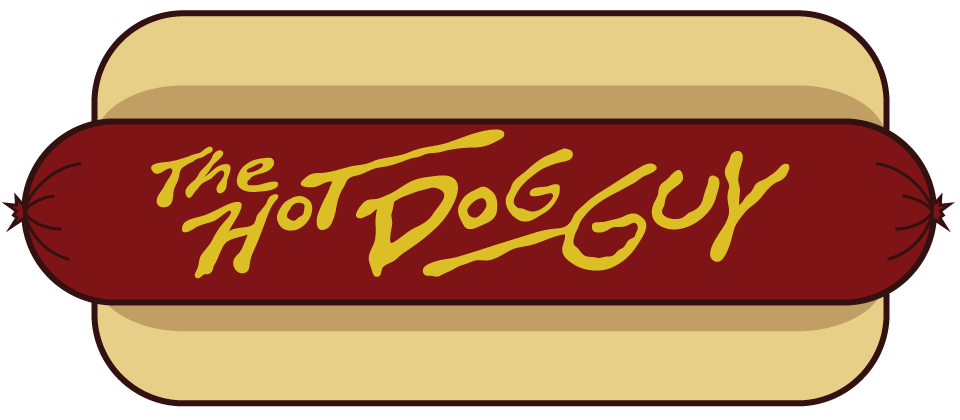
THE HOT DOG GUY
This mobile hot dog stand needed a fresh identity. The client selected the second image as their new logo.
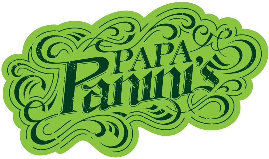
PAPA PANINI'S
A made-to-order panini shop. This logo is featured in the book LogoLounge 6.

MEAN WINGS
Proposed lettermark for a homestyle fast-food restaurant.

EAGLE ICE
This eagle-penguin hybrid served as the mark for a snowcone stand.
